Oct 31, 2009

Ode to bridges

Bridges are incredible displays of ingenuity and landmark designs.   Their noble structures and expansive reach summon admiration and awe from onlookers. 

This week, while looking through my photo collections from the last couple of years, I realized I had quite a few photos of bridges.  My interest in bridges must stem, in part, from living in Portland, aka Bridgetown.  (Within the city are ten bridges crossing the Willamette River!)

Industrial forms are also an intriguing subject for me to shoot.  Bridges, in particular, have a skeletal quality that can dissect the picture plane into repeating shapes.  Pattern, once again, becomes a strong element in the composition of the photograph. 


Oct 30, 2009

Reconnecting with my roots in "Returning home"


This week I ventured into watercolors, which is a medium I rarely use in my art. The work, entitled "Returning home," evolved from a stream of consciousness.  As I started laying down colors, the blended blues and greens reminded me of my home place, the Pacific Northwest. 

Reflecting on my own journey back to Portland and my Asian heritage, I added representational pieces to the work, including migrating cranes, growing roots, and a patterned sphere inspired by vintage silk fabrics

I really enjoyed working on this piece and am looking forward to creating more mixed media works with watercolors.  To see this and other works I've created the last few weeks, visit my shop site here.  


Oct 29, 2009

Crocheted baskets and bags for the home


There's a handmade revolution under way, and I'm not talking about the popular online marketplace Etsy.  It's happening right here in my own home.

I love making things with my hands, and I love a good challenge.  So basically I spend countless hours each week figuring out new patterns, techniques, and materials.  My husband contends that it's a disease I have, and I'm finally accepting the fact that he may be right.

When I was at the library looking through crochet books, I came across a pattern for a basket that I wanted to make.  The next day I was off to the yarn store buying hemp fibers. Although making handmade items is not cost-effective nor time-effective, there's something so satisfying with the completion of a project (the basket I finished is shown above).

Here are a couple more ideas on my potential project list:


Isn't this bag great?  The pattern is from Carol Ventura, a professor of art in Tennessee, and it can be found on a site that I just recently discovered called Knit on the Net. This handcrafter's site has been around for a few years and has free patterns available for diy enthusiasts.

While browsing The Purl Bee, I also came across this pattern for a crocheted grocery tote.  They have great pictures at every step, which is so helpful for the visual learner like myself.  I can't wait to see how this one turns out!


Oct 28, 2009

The discipline of drawing every day

It's a universal understanding that if we want to master a skill, we need to commit to practicing it as much as we can.  Drawing is no exception.  Although I do believe that some folks have an aptitude for the arts, drawing is essentially a learned skill like playing basketball, piano, or cooking. 

The most difficult part of drawing every day is not the act itself but the discipline. So when I came across Lauren Nassef's blog on drawing a picture every day, I was inspired by her dedication to her art.  Committed to this project for two years now, her blog is rich with eye-catching illustrations.  Most of her drawings are of people, detailing their expressions and poses with fine lines.  I love how some of the drawings are unfinished- a beautiful reminder that drawing is as much about the process as it is about the end product. 

Here's a sampling of some of Lauren's works. 


Oct 27, 2009

How to take dramatic black and white portraits of children


When I look through a viewfinder, I see the world in black and white, or better yet, light and dark.  The word photography actually means writing in light in Greek (photos + graphos).  I love this definition because it captures the essence of photography.  Light travels through an opening in a box (that is, the camera), where it records a single moment in time.

When taking portraits of children,  I look for how light shapes their faces.  Sometimes I like to shoot more dramatic pictures, where there is a strong contrast between the subject and the background. Here are some tips on how to set up photographs like the ones shown here.

1.  Use a single light source indoors, like a window, or diffused light outside.  Have the child facing the light.

2.  Create distance between the subject and the dim background.  If you're outside, for example, have the child stand in front of an open door (which was the setup for the portrait below). 

3.  Shoot with a large aperture (which means a smaller number!). This will create a narrow plane of focus and blur the background. Switch from automatic mode on your camera to aperture-priority.  This is usually the setting that starts with an "A" on the top dial. 

4. If you have a zoom lens, get in close by using a longer focal length.  With portraits, I shoot with 85mm the most.

5. Get down at the child's level.  This makes it easier to engage with the child and capture spontaneous facial expressions.

6. Don't have your subjects "say cheese" unless you're going for the fake smile look.  If you want a natural smile, then make a funny face.  I actually try to take all candid shots.  I don't even mind photos with food on their faces!


Oct 26, 2009

Plan a free family trip to the art museum


Vincent Van Gogh, Starry Night Over the Rhone, 1888.

Art is meant to be experienced in person.  It's hard to capture an authentic response to an art work when it's on a page of a book. I became a fan of Vincent Van Gogh, for example, only after seeing his painting Starry Night Over the Rhone in Musee d'Orsay. When I walked into the room, it was as if the heavens had parted and the angels were singing (granted there was a skylight). The colors and textures of the canvas were so much more vivid than its reproductions! 

Looking at art in museums is a wonderful way to expose children to different cultural worlds and pasts.  It's an enrichening experience that will help children grow in their confidence and knowledge of the arts.  It's also a great opportunity for parents to engage in significant dialogues with their children about different themes that they'll see, like war, romance, and religion.

Many established museums provide parents with tools and resources on how to look at art with children.  Here's one site I found on the Museum of Modern Art's website that has some great tips. There are also family programs available at the museums, such as guided tours and hands-on art workshops.  A lot of these programs are free with the purchase of admission.

If the cost of admission is an issue, there are free museum admission days throughout the year.  What a deal!  To help you start planning your next trip to the art museum, I've listed some of the special event days below.

Portland Art Museum.  Free admission every fourth Friday of the month, 5 - 8p.  Four free Sundays a year; the next free family day is Sunday, Nov. 8.

San Francisco Museum of Modern Art.  Free admission first Tuesday of each month.

Art Institute of Chicago.  Free admission Thursday nights 5 - 8p.

National Gallery of Art.  Admission is always free!

Museum of Modern Art in New York City offers family programs with free admission.  See details on their site.

Guggenheim in New York City.  Not free, but great discounted rate.  Every second Sunday of the month and Family Day, admission is only $15 per family.  The next Family Day is on Nov. 22.

The picture below is a photograph that one of my students took and gave me after visiting the Guggenheim with her family.


Oct 25, 2009

Wooden mannequins for drawing and decor


A live model is always ideal when drawing the human figure, but wooden mannequins are handy as a reference for proportion. The adjustable forms can be posed in still or action positions, helping artists to focus on the ratio of one part to the next.

Wooden mannequins can be found in different sizes and forms, such as male and female figures, hands, and horses.  They are great for young artists because their forms are simple, and it's fun for kids to move the mannequins into different poses.  However, being fully jointed, the mannequins are susceptible to damage with a careless jolt of an arm or leg. I, unfortunately, have seen many mannequin casualties in the classroom. 

Wooden mannequins also make great accessories in the home office, studio, or family room.  It's not uncommon anymore to see them in home decor catalogs. And being quite affordable, the element of art can be brought into any living space. 

Oct 24, 2009

Henri Matisse, a leader of "Wild Beasts"

Henri Matisse is one of my favorite artists.  Lawyer turned artist, Matisse is labeled by art historians as the leader of Fauvism, an art movement in Paris at the turn of the 20th century. The name of the movement stems from a critic's response to a 1905 art exhibition that showcased paintings by Matisse and other local artists.  A critic called the artists in the show les fauves (the wild beasts in French) after being so appalled by their use of vibrant, contrasting colors and impulsive brushstrokes.

Matisse's Woman in a Hat was one of the paintings in the exhibition that caused quite a stir. Instead of conventional flesh tones to highlight the facial structure of his subject, he used bright and bold colors ranging in blues to yellows to reds.  Take a look at the green stripe down the nose to separate the cool shadows of one side of the face from the warm tones of the other- brilliant!

Henri Matisse,  Woman with a Hat,  oil on canvas, 31.25 in. x 23.5 in., 1905. San Francisco Museum of Art.

Ever since I first studied The Red Studio in an art history course nearly 20 years ago, it has been one of my favorite Matisse paintings.  It is a great discussion piece on whether or not Matisse was successful in creating the illusion of perspective.  I also love the dynamic red color of the canvas complemented by splashes of pinks (a tint of red) and greens (the opposite of red).

Henri Matisse, The Red Studio, oil on canvas, 1911. MoMA.

As Matisse's health turned for the worse in 1941, he started creating collages out of colored paper. Matisse wrote, "The paper cutouts allow me to draw with color. For me, it is a simplification. Instead of drawing an outline and then filling in with color - with one modifying the other - I draw directly in color... It is not a starting point, it is a completion."

Only a master artist can simplify complex, natural forms in such a minimal and organic style.  Just beautiful.


Henri Matisse, Blue Nude, paper cut out, 1952. Musée Henri Matisse.


Henri Matisse, Snow Flowers, watercolor and gouache on cut and pasted papers, 1951. 

Oct 23, 2009

New work: "You are here."

My new piece for this week is titled "You are here."  It's a monotype with layered oils on top, mounted on a 6" x 6" birch panel.  If you were to scrape off all the paint, you would see a pen drawing of the Space Needle on the print.  Although I liked the placement of the drawing, I ultimately didn't like the thickness of the lines.  I let it be for a day, but by next morning, I was taking out the oil tubes.

Oct 22, 2009

Corey Arnold, the photographer that fishes

It seems like wherever I go in Portland, someone is connected to Corey Arnold.  Just recently, his name has been brought up in conversations I've had with his friends, neighbors, and colleagues. Although I have yet to meet the guy, I am very familiar with his amazing photography.

Corey is most well known for his photos of the fishing industry.  A fisherman himself, Corey spends months at sea documenting the glories and perils of commercial fishing.  The thing I most appreciate about his photos is the honesty.  Catching crabs is not a glamorous job, and he balances this candid reality with the authentic beauty and drama of the sea.

Here are a few photos from one of Corey's fishing trips in Norway:


Photos in order: The Birds, Rost Torsk, Big Sei Set, Hyse, The Tangle

I recommend that you also check out this great slideshow where Corey talks about his fishing and photo experiences.

Oct 21, 2009

Creative and greener ways to wrap gifts

Posting on the giveaway got me thinking about the holiday gift season that is fast approaching.  One of my goals this year is to wrap gifts using more earth friendly materials.  Here are a few of my ideas, but I'd love to hear your own creative solutions!  

Option #1: Recycled craft paper and hemp twine or repurposed yarn
This is how I wrap most gifts nowadays.  Craft paper is easy to use, cost-effective, and a step above the Sunday comics! Last weekend, I was running behind and needing to quickly wrap a wedding gift.  I couldn't find the natural twine that I normally use as a tie, so I grabbed a crochet sampling my daughter had made.  By tying the ends together, it made a cute little pompom- perfect for a gift topper.


Option #2: Recycled paper bags and boxes with personalized designs

At my shop, we used cardboard boxes, bags, and tissue that were made from recycled paper.  My business partner printed original designs on the packaging using a home printing system.  A more affordable alternative is the use of custom stamps.  You can have your own design made into a stamp for a reasonable price, as long as the size of the stamp is relatively small.  My suggestion is to create a pattern that can continue across a box or bag.  Just add a couple of rows for a striking feature.


Option #3: Drawstring bags from scrap or found fabrics
This is one that I'm really excited about, because it's something that can be used over and over again.  I just recently purchased unbleached muslin, which is an excellent fabric for drawstring bags.  It's gender neutral and easy to adorn.  Instead of using gift tags, you can embroider names on the bags. 


A cute little drawstring bag that is part of Pigeon Toe Ceramics' Stacking Thimble Cup Set.

Oct 20, 2009

Giveaway! "Birch Forest in Summer"


Birch Forest in Summer, oils and pen on 8" x 8" x .75" panel, 2009. 

To celebrate nearly a month of blogging (blog years are like dog years),  I've decided to do a giveaway!  One lucky reader will receive the "Birch Forest in Summer" painted by yours truly ($70 value).  Just comment on a post from now through Nov. 9th to enter.  

I'm not into lengthy rules, but I do like to play fair.  So here are some things to consider:

1.  Anyone over the age of 18 can enter the giveaway- just be sure your profile has a way for me to contact you!  
2.  Participants can have as many as five entries (one comment per post).
3.  I will ship the art work to you for free if you live in the U.S.  For any readers who live outside of the U.S., there will be a partial shipping fee.
4.  All comments are read before published.  Anything obscene, self-promoting, or nonsensical, will be edited or deleted.  I like to reward only nice people.
5.  Winner's name will be announced on the Nov. 10th post.

Good luck, and I look forward to replying to your comments!

Oct 19, 2009

Compelling art from Jennifer Sánchez and Yellena James

The contemporary works of NYC-based Jennifer Sanchez and Portland's own Yellena James truly resonate with who I am as an artist.  I love their use of bold colors and detailed patterning, and their abstract subjects burst with energy and movement.  Sanchez' works remind me of an exciting day at the carnival, and James' a fantastic world under the sea. 

I've arranged their works below to highlight the noticeable similarities.  Strong elements in Sanchez' and James' art include repetitive circles, the color black to help create depth and contrast, and clusters of lines that reach for the edge of the canvas. 


Jennifer Sanchez, ny.09.#07, mixed media on canvas, 30" x 40" x 1.5", 2009.


Yellena James, Thistle, pen and ink on paper, 7.5" x 7.5", 2008.


Jennifer Sanchez, ny.09.#06, mixed media on canvas, 24" x 36", 2009.


Yellena James, Fizz, pen and ink on paper, 7.5" x 7.5", 2008.


Jennifer Sanchez, ny.09.#21, mixed media on paper, 10" x 10", 2009.


Yellena James, Flare, pen and ink on paper, 8" x 10",  2007.


Jennifer Sanchez, ny.09.#15, mixed media on paper, 7" x 7", 2009.


Yellena James, Bluster, pen and ink on paper, 7.5" x 7.5", 2008.

 Sources: www.miss-sanchez.com and www.yellena.com

Oct 18, 2009

Using photo apps to enhance pictures

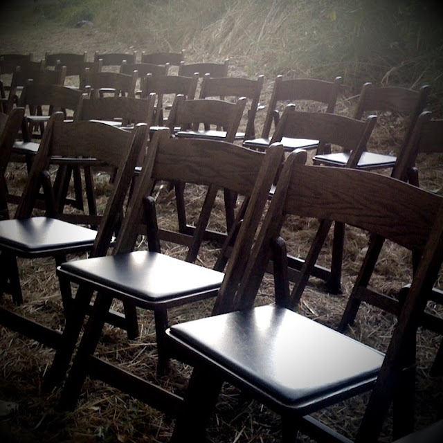
I attendend a beautiful outdoor wedding yesterday on Sauvie Island.  The scenery was breathtaking, and I was kicking myself for not bringing my camera.  I decided to take a few shots with my iPhone and play around with the pictures using a couple of different iPhone apps- CameraBag and TiltShift Generator.  I have to admit that I'm pretty impressed with the special effects of photo applications nowadays:

CameraBag, Helga mode


TiltShift with lateral blur effect


TiltShift with vignetting


CameraBag, Lolo mode

Oct 17, 2009

The art of folding paper


Yesterday I posted new art work that was inspired by my grandmother's love of folding paper.  When I was a little girl, she would sit with me and show me how to fold a square piece of paper into different objects and creatures.  My favorite was the canoe, which I would try to float on water.

My grandmother started gifting her paper treasures to those closest to her, 1000 cranes at a time.  When I opened my business two years ago, she brought 3000 cranes to the store opening.  She was 95. 

My grandmother was folding paper cranes even in the last moments of her life.  She passed away in May, but her love and inspiration will always live on through tens of thousands of paper cranes.

Oct 16, 2009

New work: One Red Paper Crane

My new work for the week, One Red Paper Crane.  It's a 6" x 6" mixed media on birch panel.


Oct 15, 2009

A local ceramic artist's studio


Today I paid Lisa Jones a visit.  Lisa is the founder of and creative behind Pigeon Toe Ceramics, which is a collection of beautiful, hand thrown porcelain vessels.  Lisa's work room is part of an artist shared space called Radius Studio.  The two level building is located underneath the Morrison Bridge in the SE industrial area of Portland.

Lisa recently moved from one room in the basement to an enclosed space right next to the kilns.  Today was my first visit to the new room, and I loved some of the new changes she made.  An entire wall of the studio, for example, was painted in chalkboard paint, where Lisa keeps track of all her immediate orders.  What a great idea!

One of my favorite things about visiting artists in their studios is seeing their current projects.  Lisa took the cover off of an item on the shelf and revealed a light fixture that she had made for a local bakery.  We talked about the challenges of throwing larger vessels on the wheel, including how taxing it is on the arms.  The result was dramatic though, and I look forward to seeing more of her larger scaled works in the future!