Showing posts with label art history. Show all posts

welcome back, rothko

Apr 30, 2012

 Rothko (Taschen 25th Anniversary Special Edition) by Jacob Baal-Teshuva.  The Portland Art Museum in the background.
Mark Rothko (1903-1970)

Mark Rothko and I have a few things in common.  We both taught art, have a fascination with Matisse's Red Studio, and we have roots in Portland, Oregon.  In fact, we attended the same high school- Rothko, 65 years prior.

I am a huge fan of Rothko's signature color-block paintings.  So, I was thrilled to say the least when I first heard that the Portland Art Museum would be showcasing 45 of his works this spring.  It was at the Portland Art Museum where his first one-man show took place in 1933.

I decided to go the Rothko exhibition on my birthday last month.  I wanted a quiet evening with my husband, and looking at art in a museum is about as quiet as you can get.  For a moment, time was forgotten as we slowly moved from one painting to the next.  The works in the show span 40 years of Rothko's art career, so there was a lot to take in and process.

I like to study paintings up-close.  I try to decrypt the layers of paint and sequence of brushstrokes.  By understanding the creative process, I feel that I have a better grasp of the artist's emotions involved.  Rothko himself encouraged viewers to look at his art at an intimate proximity for this very reason. 
"The people who weep before my pictures are having the same religious experience I had when I painted them. And if you, as you say, are moved only by their color relationship, then you miss the point."

Hickey Robertson.The Rothko Chapel

If I'm ever in Houston, Texas, on my must-see list is The Rothko Chapel.  The non-denominational chapel was completed in 1971.  Inside are fourteen Rothko paintings.  What a beautiful space to go to for spiritual reflection and meditation!

documentating art in caves and on the street

Feb 29, 2012

I like to watch documentary films.  This past month I watched two documentaries about art- Werner Herzog's Cave of Forgotten Dreams and Exit Through The Gift Shop.  If you haven't seen these films, check out the trailers. 


Initially, the two documentaries seem to have very little in common.  One film is about ancient cave paintings and the other, street art.  But, as I've had a few weeks to reflect, I realized that Cave and Exit share a number of common themes regarding art.

The first theme involves the permanence of art.  The cave paintings of Chauvet [in France] are noted to be the oldest pictorial works of ancient time.  Scientists date the images to as far back as 35,000 years ago! Although some have questioned the dating methods used, we can all agree that the paintings are really old.  I find it fascinating that primitive art [essentially natural pigment and charcoal on rock] can last for thousands of years, and artists today are challenged with the integrity of modern art materials. 

Permanence has always been a core issue for artists.  Ironically, one modern form of art, street art, finds relevance in impermanence.  Exit testifies to this increasingly popular and very temporary art form, showcasing footage of notable street artists at work.  Like the early cave artists before them, street artists choose to display their works on walls.  But, these works are usually created in public urban spaces, so they are either promptly removed or left to decay with a dilapidated building.

Banksy, Los Angeles, 2011.  [image source: www.banksy.co.uk]


Another prevalent theme in both Cave and Exit is anonymity in art.  In both films, the identities of artists are passionately pursued. Even the director of Exit, renown street artist Banksy, remains anonymous today.  Anonymity is a way of life for many street artists, which is increasingly harder to achieve in today's very public culture.

Street artists choose to be anonymous, whereas the primitive artists of Chauvet are anonymous by the lack of a written language.  In Cave, the work of one cave artist was distinguished from the others by the repeated use of his hand print.  Archaeologists were able to track his work throughout the cave because of the imprint of a crooked pinky finger on the right hand.  This particular story struck a chord with me because I have a crooked pinky on my right hand as well [thanks to flag football].  Although we will never know the name or face of this early artist, his hand print with the crooked finger is his signature and identity.

Both films, Cave and Exit, document the creative nature of man.  When the first shots of the Chauvet images came across the screen, I was mesmerized by the beautiful details and craftsmanship of the line drawings.  Some of the animal drawings were layered or repeated, as if to show movement and action.  Clearly, the prehistoric art in Chauvet Cave is evidence of man's innate creative ability.  We are wired as humans to be inventive, inspired, and expressive. 

Exit celebrates the unique art and passion of street artists, but the film is really about one man's fascination with street art and his emergence as a street artist himself.  Although the self-proclaimed artist mimics the style of other artists, his debut in Los Angeles is a big success.  By the end of the film, Banksy leads us to the age-old question, what is art?  And is a penchant for art enough to call oneself an artist?  The featured artist even states at the end of the movie that only time will tell if he's a real artist . . . perhaps in another 35,000 years. 

An inspirational getaway

Jul 6, 2011

Klamath Lake

After two months of hunkering down at my art desk, I relished the idea of getting out of town and retreating to Oregon's natural wonders.  I needed a boost of inspiration, and the beautiful mountainous landscape is always the perfect remedy. 

Toketee Falls and North Umpqua River

On our way to southern Oregon, we decided to take a scenic route known for its picturesque waterfalls.  We stopped at a few sites, including Toketee Falls shown above.  In the Chinook Indian language, "toketee" means graceful or pretty- an appropriate name indeed. 

Skull Cave at Lava Beds National Monument

There was one day my husband allotted as a "surprise."  When we crossed the Oregon-California border, the girls and I became increasingly curious about our adventure to come.  About 15 minutes from our destination, my husband revealed that we were going spelunking!  I love the fact that the girls squealed in excitement when they found out that we were going to explore caves. 


It was a first for all of us, and the day trip will go down as one of our favorite family adventures.  We hiked, climbed, and even crawled through rocky crevices. 

pictographs in Symbol Bridge Cave

One of my highlights was seeing these pictographs in a cave.  These ancient markings were made by Native Americans who were most likely on spiritual quests when venturing to this cave.  It's amazing to me that markings made by man hundreds -or possibly thousands- of years ago are not too different from illustrated designs today.  Can you see the dotted pattern along the edge of the rock in the left photo?  Reminds me of something I would do . . .  a compelling experience for sure.

Art is more than just a pretty painting

Apr 7, 2011

Yeffe Kimball, Fawn and Spirits, 1942, oil on canvas, 19 in x 29 in, Portland Art Museum, gift of Dr. William K. Livingston.

I recently fell in love with this painting at the Portland Art Museum.  I tried to find more information about it on the internet but couldn't even locate an image.  I eventually contacted the museum, who is permitting me to use this image for my post. 

Information on the artist Yeffe Kimball (? - 1978) is scarce on the internet, but the little information I did find was fascinating and quite controversial.  Kimball,  who is a noted figure in the modern Native American arts community, is believed to have fabricated her ancestral connection to the Osage tribe.  This raises a lot of questions for me on how an artist's personal life impacts our opinion of their work.  Here we have an example of an artist whose artistic career greatly benefited from her cultural claims. Her works have hung in numerous museums and galleries, some dedicated solely to Native American art.   

I would be lying if I were to say that this doesn't bother me.  If Kimball doesn't have any Native American roots, then her work shouldn't be recognized as modern Native American art. 

Jackson Pollock, Number 1, 1950 (Lavender Mist),1950, National Gallery of Art, Ailsa Mellon Bruce Fund, 1976.

I realize that a lot of great art comes with controversy, controversy related to the art itself and controversy pertaining to the individual artist.  I watched the film Pollock for the first time just last week.  I have always been a huge fan of Jackson Pollock's art, but, while watching the movie,  I was reminded again of the details surrounding his tragic death.  While drinking and driving, he killed himself and a passenger in his car.  I struggle with the fact that his reckless actions took another life, and yet his painting, No. 5, 1948,  sold for $140 million dollars in 2006- the highest price tag for a painting to date. 

Art is not meant to be black and white, I get it.  And, as much as we like to talk about "pretty" art, sometimes we need to ask the hard questions.  So, what do you think?  Should the details of an artist's personal life have any impact in our response to their art?

Interview with artist and art conservator Chris Zahner

Jan 5, 2011

Kathy, a collage by artist Chris Zahner


If I were a Marvel Comics character,  I'd want to be a superhero by night and an art conservator by day.  It'd be nice to know that at the end of a day's work, I saved some lives and a few precious paintings.  My real life doesn't come close to my comic book character, but I recently connected with an artist who at least lives the life of my alter-ego.  Boston-based artist Chris Zahner (even sounds like an alter-ego name), works in art conservation.  Since I really don't know much about art conservation, Chris was kind enough to answer a few of my questions.

How did you get into art conservation?

One of the many interesting aspects about the field is the seemingly endless ways people find it. Art conservation is a melding of art history, studio art and science, so people come from all kinds of backgrounds. Studio art is my angle. I have a BFA from the Cleveland Institute of Art in ceramics with a minor in drawing.  Through the encouragement and support of a few conservator friends my interest in the field began.  My first conservation job was at a regional lab in Cleveland called the Intermuseum Conservation Association where I was the preparator in their paper department. I became hooked.

Chris at work.

What does a typical day at your work look like?

Like most kids I wasn’t sure what I wanted to do when I grew up, but I had a really good sense of what I didn’t want. Boredom, monotony and cubicles were out. Challenges, problem solving, creativity and a life connected to the arts were in. So far art conservation has been the perfect job for me specifically because there are no “typical” days. One day might be spent logging hours in front of a computer writing reports while the following day might require you to put on a hard hat, climb scaffolding and clean a mural 30 feet up.

[image source: Intermuseum Conservation Association]
What are some things about art conservation that most people don't know?

People don’t realize there is a difference between conservation and restoration. Art conservation and restoration mainly differ in approach. A restorer makes an attempt to return an object as close to its original condition as possible, while the conservator’s primary goal is to prevent further deterioration even if the overall appearance might not look significantly different. Conservation is usually more of a light touch.

There is also a gulf between the two fields in terms of education. Art conservators have a Masters degree in a specific discipline such as paintings, paper, books, sculpture, photographs...etc. because of the increasingly technical nature of the profession.  A restorer is generally an artisan and often a very skilled one, but lacks the formal training that a conservator would.  That’s not to say there aren’t some very capable restorers out there who treat object with great care, but I would take your Old Master etching or first edition books to a conservator who specializes in that particular discipline.

Before and after pictures of one of Chris' conservation projects.


What has been the most fascinating project you've worked on?

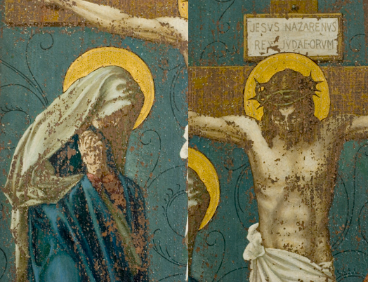
This might not be the most fascinating project I’ve worked on, but it might be one of the most dramatic. I received a phone call from a friend of mine who was a private paintings conservator in Dayton, Ohio asking me if I would be interested in helping him with a large project. A local chapel had hired him to help with their 14 station of the cross paintings. Painted by an art student from the Dayton Art Institute these paintings were executed on copper panels and showed various degrees of flaking and missing paint.

The brown color is the copper panel showing through.


Flaking paint was attached to the panel using a heat activated adhesive. We filled in all the valleys where the paint was missing with a conservation putty to insure the painting would have a consistent plane when finished.  All the white spots in the photo below represent where paint was totally missing.


Time for inpainting. Using conservation grade paints all the white areas and ONLY the white areas had to be reconstructed. You would never want to paint over existing paint, only the fills.


This piece is a good example of restoration as a conservation treatment. The painting has been stabilized, further flaking has been deterred and the inpainting does restore the work to something close to its original condition.

Do you have any practical advice for art collectors on how to take care of art?

Your home doesn’t need to be like a museum, but owning original artworks is a responsibility that should be taken seriously. There are conditions that have detrimental consequences to your work that you should be aware of. Light is no friend to paintings and objects on paper, so keep pieces out of direct sunlight and don’t use picture lights. UV glass or plexiglass is great when framing works on paper, but that’s not a green light to hang something across from that giant window in your home. Humidity and large fluctuations in temperature are also a problem, so don’t hang original works in your bathroom or over your fireplace. If you have concerns about specific objects in your home refer to the American Institute for Conservation of Historic and Artistic Works.

Thanks, Chris, for the such a fascinating and informative interview!  To see some of Chris' wonderful original art, check out his Etsy shop here.  He also has a great art blog called Flopslump.  (Catch a recent feature with yours truly here.)

Inspired by Kandinsky

Nov 3, 2010


If you're ever in Powell's Books in downtown Portland, you may find me perusing books in the bountiful art section.  Last year, I found this wonderful 1979 book on Russian-born artist Wassily Kandinsky (1866 - 1944).  Recognized as the father of abstract art, Kandinsky's works have inspired artists and admirers for the past 100 years.  Kandinsky has been a favorite artist of mine since I surveyed his works in an art history class 20 years ago.


I have always been a fan of this particular watercolor and ink painting, which art historians identify as being the first nonobjective art work.  Kandinsky painted this piece in 1910, yet it still maintains such a contemporary impression.  I truly love all the loose line strokes and the impulsive placement of vibrant, pure colors.  My work tends to be very structured, so I find this work to be so freeing.


I rarely "doodle" in my sketchbook, and I realized recently that I needed to allow myself to play around more with color and line. So, I started working on some pieces that were less representational and more spontaneous in design.


I like how this sketch turned out. It eventually became a study for a new piece called Daydream.


Daydream is a compilation of design elements that I've been using in my art the past year.  So, when looking at the work, it's like looking at memory bits.

Daydream is one of the pieces that will be part of next month's art show, which I will write more about tomorrow.

If walls could talk

Oct 15, 2010

An old school picture form and handwritten letters dating back to 1927. 

In the French film Amélie, the discovery of a little toy hidden in the wall of an old apartment leads to life-changing events for a young woman and those around her.  I have yet to find a beloved toy in the walls of my home, but I have experienced the delight of discovering other personal items, including handwritten letters, old magazines, and even a vintage camera.

Opening up a wall in an old home is like an archeology dig.  After a few major remodels, I have found that it's not uncommon to find little treasures or lost items tucked away in the walls.  It's not a question anymore of if there's something behind a wall, but what?


Letters and publications seem to be a common find in walls.  Here are a couple of old Life Magazines we found in decommissioned ducts of our 1948 home in Eugene, Oregon.  Inside one of the magazines, there is a feature on Russian-born American artist Max Weber (1881 - 1961). 


The article was written by Winthrop Sargeant (what a great name).  Here's an excerpt from the introductory paragraph.

To the average person the somber landscapes, primitive portraits and slablike nudes that Max Weber paints look deceptively heavy, coarse and unskilled.  But to fellow artists, Weber's work places him as the greatest artist in America and one of the few really great ones in the world. . . Weber's brooding canvases have been shown and bought by virtually every important museum in the country.  They have won the most important prizes the art world has to offer.  Collectors buy them avidly at prices that sometimes reach early five figures.   

Our greatest find to date is a Kodak Folding Brownie camera (manufactured sometime between 1916 - 1926) in its original case.  We were replacing a kitchen cabinet, and there it was behind the cabinet wall!

   
One day I would love to run some film through it.  The camera is upside-down in the picture, but the cable is what you use to snap the picture.  The viewfinder is the squarish component next to the cable.

We have also had some bizarre finds in our home.  In our first bathroom remodel, my husband and I found an enormous lot of used razor blades in the wall behind our sink. We learned that it was commonplace for men to dispose of their razor blades in little slits found on the inside of older medicine cabinets.  A fun little fact but not a fun little find.  And, in a kitchen remodel a few years ago, an electrician was reaching inside of a wall to retrieve a wire when he found a small tin vial with white powdery substance.  (This was not a keeper.)

What are some treasures you have discovered in your home?

Memories of France captured in paintings

Oct 8, 2010

Water Lilies, Claude Monet, 1914.

I miss France.  We spent a few weeks of our summer in '98 traveling all over the country. I still have so many vivid memories from the trip.  Yesterday, I was looking through my pictures of France when I had a revelation of sorts.  Could it be that France is such a memorable place because of famous works of art that I had been exposed to? Strolling through Giverny, for example, it wasn't hard for me to see where Monet got his inspiration.  The pond and Japanese bridge were just like how he had painted them.  (The photos on the right are the pictures I took on my trip.) 

Café Terrace At Night, Vincent Van Gogh, 1888.

Vincent Van Gogh's paintings came alive in Arles.  When we were passing a vast sunflower field outside of town, we had to pull over and take some pictures up close.  I soon found myself standing amid these enormous flowers, and it was as if time stood still.  I could imagine Van Gogh, with his easel and palette, painting such a glorious scene. 

Above is Van Gogh's famous painting, Café Terrace At Night.  We were there only during the day, but you can see that even the tree still looks the same 110 years later!

Lake at Annecy, Paul Cezanne, 1890 - 1892.

My favorite city on our trip was Annecy, in the French Alps region.  The mountain air is crisp, and the lake is so clear. In many ways, it reminds me of Oregon (minus the gigantic castles on the water!).

When I think of mountainous landscapes in France, I think of Post-Impressionist artist Paul Cezanne. I love the serene setting that Cezanne captured in his painting Lake at Annecy.  Perfect!

The Jetty at Cassis, Opus 198, Paul Signac, 1889.

The most memorable moment of our trip was in Cassis, a small town on the Mediterranean.  My husband and I had the most amazing dining experience at a family-run Greek restaurant at the point of the pier.  The food was outrageously good, the hospitality was unforgettable, and the view was breathless.  

I rediscovered Paul Signac's painting of The Jetty at Cassis just yesterday.  (I find it startlingly similar to the photo I took on the beach!)  Signac's pointillist style is so fitting for such a beautiful coastal scene.

The Pont Neuf, Paris, Pierre-Auguste Renior, 1872.

Walking through the streets of Paris was an amazing experience.  I took this photo of the city atop of Notre Dame.  It seems like the cityscape hasn't changed much since Renior's 1872 rendering- minus one major attraction.  The Eiffel Tower wasn't built until 1889.

The beautiful surroundings and rich cultural history of France has been an inspiration to artists for many centuries.  One day, I'll be back- maybe even for an extended stay.  Until then, I'll continue to relive my wonderful time in France through photographs and paintings.

Comparing art: Gérard Dubois and René Magritte

Oct 6, 2010

Works by René Magritte (left) and Gérard Dubois (right)

The illustrative works of Montréal-based artist Gérard Dubois are featured in major publications, such as The New Yorker, Time Magazine, Le Monde, and Rolling Stone.  While browsing DuBois' collection of works on his website, I was reminded of the works of Surrealist artist- René Magritte (whose works are shown here on the left).


It's hard to believe that there is a 70-year span between the two artists (Magritte dying the year before DuBois was born). These particular works of art share so many similar qualities regarding composition, imagery, and color choice.  The objects depicted in their works seem to come from the same time period, yet there is a timelessness about their art.  Maybe this explains the common use of Magritte's art in media even today.

Artists I like: Gunta Stölzl

Aug 24, 2010

Outside of quilting, I don't have much experience in the fiber arts, but I secretly fantasize about owning my own loom and knitting machine one day.  I even periodically check craigslist ads just to see if there's a "meant to be" sale (shh, don't tell my husband).

And then the logical side of my brain eventually kicks in, and I realize that I don't have the space or time to learn another art form.  So I wait, and I continue to drool over amazing wall hangings like these.

 
What is it about textiles on the wall that make me so weak in the knees?  Kathrin from Annekata first introduced me to the works of Bauhaus artist Gunta Stölzl, and my heart skipped a beat!  How could I have not known about Stölzl's art after years of art history courses?  I questioned the academic integrity of my alma mater for a moment while I was in utter awe of Stölzl's works.  

Everything about Stölzl's wall hangings excites me- the colorful palettes, the dynamic pattern displays, and the various woven textures.  It's hard to believe that the works shown here were created in the 1920s.  They still look so contemporary in design.

Stölzl's wall hangings span over six decades.  I love these two pieces completed in the later years of her career. In the second piece, the movement of lines is so much more organic.  And the colors pop against a neutral background, creating a sense of dimension. 


Stölzl's beautiful wall hangings and fabrics are catalogued here.  Also included are Stölzl's design studies.  Here are a couple of my favorites.  The one on the right looks like it could be a quilted piece.  I can see different block patterns, like the flying geese and the nine patch block. 

Old School 3-D

May 10, 2010


When I was vintage shopping at the beach the other weekend, I found a box of stereographic cards in one of the antique stores.  I had never seen photographs like these before.  The lady behind the counter informed me that these cards were designed to be used with a stereoscope, which gives the viewer a 3-D image.  I was charmed by the stereographic cards and ended up buying a couple.  The above photo is of Lauterbrunnen, Switzerland.  I picked this particular photo because I was mesmerized by the majestic scenery, and I guess I wasn't the only one.  When researching this beautiful Alpine village online, I found out that it was the inspiration for J.R.R. Tolkien's Elven valley, Rivendell. Very cool!


On the backs of the cards are descriptions of the images.  Some read more like stories than formal summaries.  Here is the text accompanying the Bluebird's Nest photo.


I find it intriguing that 100 years later, 3-D images are a fad again.  More and more, newly released movies are being viewed in 3-D.  I expect to see museums move in this direction, creating virtual tours of architectural and sculptural masterpieces. On the Louvre's website, there is an "Explore in 3D" section.  Here's the link to the page if you want to check it out.

Aalto utopia in Portland's backyard

Apr 23, 2010


When I was in college, I went on a field trip to the Mount Angel Abbey Library, which is about 30 miles south of Portland.  That trip was my first exposure to the Finnish architect Alvar Aalto, who many consider to be the father of modern architecture and design.  The library at Mount Angel is just one of two buildings in North America that was designed by Aalto, and, yesterday, I went back to the building to bask again in its brilliance. 

Libraries were some of Aalto's favorite buildings to design.  He sought to create the perfect lighting conditions for reading.  In the Mount Angel Abbey Library,  there are semi-circular windows at the top of the building to harness natural light.  The light is bounced around the open interior space by white walls.  When asked why the building didn't have more windows taking advantage of the valley view, he responded "I have designed a place of study, not a lounge."

Aalto made an exception to add a few large windows in the Periodical Reading Room, which is my favorite part of the library.  I love how the bright, filtered light contrasts the black Aalto furniture.  The look is dramatic but very inviting and peaceful at the same time. 


Periodical Reading Room


In addition to its significant architectural design, the library has one of the largest collections of furniture designed by Aalto.  The shelving, desks, tables, chairs, and light fixtures were all designed by him.  And although 40 years have passed since the opening of the library, the furniture is still in remarkable shape.  I saw this sweet (and unused!) console sitting on the floor and was tempted to snatch it for my own home.  Alas, I figured stealing from monks would mean a lifetime of penance. 

Related Posts Plugin for WordPress, Blogger...