Stumped
Apr 15, 2010
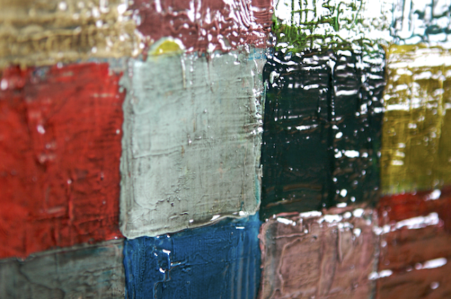
Here is a closeup of the 30 in. x 40 in. oil painting I have been working on (first mentioned in this post). In February, I decided to paint over a French landscape that I had started many years ago. Painting over a nearly completed work (of 50+ invested hours) may seem ludicrous to some, but it was actually quite liberating. I painted over the entire canvas in white so that I could see the textured layers of paint more clearly. From there, I painted squares in a cornucopia of colors. And, as you can see from the picture above, I like to apply paint very liberally. To give the painting more dimension, I coated the entire painting with a thick glossy medium tinted with black paint.
I really like how the black paint "dirtied" the painting, and I am pleased with the look of the high gloss. A glossy surface helps define details in a work, which is true in photography as well. The reflection of the light created by the gloss highlights the different ridges and layers of paint. To create a dynamic interplay of dimensional qualities, I'm going to paint a flattened design on top of the gloss. The line design will only be in one color and in a matte finish. I'm excited to see how it turns out, but this is the step that I've been stuck at for the last month. I can't seem to decide which direction to go, so I need your help!
Below are three different ideas that I sketched yesterday. I would love to think which one you think is the winner. Any other ideas are also welcomed!
1. Scattered patterns. Couldn't help but think rainbows. I like the juxtaposition of the curved lines to the geometric pattern in the background.
2. Stylized landscape. (The straight lines might be tricky with the textured surface. I might have to use tape to get clean and straight edges. Tedious but could be a cool effect.)
3. Allover pattern. I also thought about doing an allover pattern in this style showing flowers.
What is your vote?
Labels:
inspiration,
my art,
painting
Subscribe to:
Post Comments (Atom)


4 comments:
My two cents... Do you have to add anything? It looks beautiful as just the great squares of color and texture. It reminds me of great aged quilt but with a hard candy texture. It is just amazing. So beautiful. But, of the three sketches my vote is for the stylized landscape- I also like the scattered patterns but the all over pattern is too much in my opinion. I think because it takes so much away from the beauty of the squares. Can't wait to see what you end up doing. Whatever it is I am sure it will be amazing. Is this something you are going to put in your shop?
April, I'm so happy that you saw the quilt inspiration! Thanks so much for your input. I'm glad that you brought up the fact that I don't need to add anything. My husband has actually been telling me this for the last month. He also has claimed it for his office, but that's not set in stone ;)
I too like it just the way it is. I agree with April that I like the stylized landscape and a version of the scattered patterns. The rainbows are cute, but I think it may make the painting too cute. (;
Well, I, too like it the way it is. I think an addition may pull to much away from that depth and color and texture.
Post a Comment