My week

Apr 29, 2010


 i like to stop in on weekends at this neighborhood greenhouse
strawberry plants for 50 cents each
 . . . . . . . . . .
my latest mixed media piece Discovery


making progress on the quilt
. . . . . . . . . .
photo shoot of expecting mom


Marie Watt's studio

Apr 28, 2010


One of my very favorite things to do is to visit the studio of an artist, even more so than going to a museum.  It's the place where ideas are born and masterpieces are created.  Yesterday, I spent a couple of hours in the SE Portland studio of artist Marie Watt.  I first mentioned Marie's art a few weeks ago (read post here).  Marie has this amazing gift of turning old wool blankets into stunning works of art.  She is currently working on 50+ cameos for her Forget-me-not installation.  Each piece is a meticulous process of cutting and sewing, as seen in the above photo. 


I love browsing the walls of artist studios.  Shown here is Marie's tag installation that was recently on display in a museum.  Above the water cooler are three works in progress. 


One of the reasons I stopped by Marie's studio was to see a shelving unit that used to be in my shop.  They were originally designed and built by craftsman Ben Hull. They look great in the new space! 

photographs: Tom Nutt

This is Marie's 2008 Forget-me-not: Mothers and Sons installation featuring cameo portraits of men and women who made a significant mark on our community and culture.  The display is 20' in diameter and 10' tall.  To see the complete collection of cameos, visit Marie's Flickr page here.

Artists I like: Julia Pott

Apr 26, 2010


Any day now I should be getting in the mail Julia Pott's Breathe (left picture).  When I first saw it in her Etsy shop, I knew I had to have it for my walls.  I love everything about it: the textures, all the animals (I have a soft spot for panda bears), and even the date stamped on the bear's belly.

Julia is this amazing illustrator from London.  A lot of her drawings feature animals with human-like qualities, like a bear hugging a boy or a dog and cat holding hands.  They're sweet and at the same time very vulnerable, exposing some of our deepest needs and emotions in relationships.


Julia has her hand in a lot of different projects.  Recently, she worked on a multimedia project with The Decemberists.   Here's a snippet; it's very cool. 

Last day of Etsy art sale

Apr 25, 2010

Last chance to save 25 - 40% on original art in my Etsy shop.   

Aalto utopia in Portland's backyard

Apr 23, 2010


When I was in college, I went on a field trip to the Mount Angel Abbey Library, which is about 30 miles south of Portland.  That trip was my first exposure to the Finnish architect Alvar Aalto, who many consider to be the father of modern architecture and design.  The library at Mount Angel is just one of two buildings in North America that was designed by Aalto, and, yesterday, I went back to the building to bask again in its brilliance. 

Libraries were some of Aalto's favorite buildings to design.  He sought to create the perfect lighting conditions for reading.  In the Mount Angel Abbey Library,  there are semi-circular windows at the top of the building to harness natural light.  The light is bounced around the open interior space by white walls.  When asked why the building didn't have more windows taking advantage of the valley view, he responded "I have designed a place of study, not a lounge."

Aalto made an exception to add a few large windows in the Periodical Reading Room, which is my favorite part of the library.  I love how the bright, filtered light contrasts the black Aalto furniture.  The look is dramatic but very inviting and peaceful at the same time. 


Periodical Reading Room


In addition to its significant architectural design, the library has one of the largest collections of furniture designed by Aalto.  The shelving, desks, tables, chairs, and light fixtures were all designed by him.  And although 40 years have passed since the opening of the library, the furniture is still in remarkable shape.  I saw this sweet (and unused!) console sitting on the floor and was tempted to snatch it for my own home.  Alas, I figured stealing from monks would mean a lifetime of penance. 

New drawing, "Deer at the lake"

Apr 22, 2010

I just finished this pastel and ink drawing yesterday called Deer at the lake.  Another family from the animal kingdom is represented in my work.  In this piece, it's pa, ma, and baby deer.  In my previous work, camping with bears, it was mama bear with two cubs.

Also, I mentioned in a previous post that I was giving away a little something with each purchase from my Etsy shop.   It's a package of five postcards made by yours truly.  I even trimmed all the corners myself!


Artists I Like: Clare Bowers

Apr 20, 2010


Yes, I do like diamond clusters and cuddly animals and mountains in rainbow colors.  So when I came across Clare Bowers' art on Etsy, it was like she was reading my mind.  I love how she builds up  different layers and materials to create a visual melody of pattern and texture.  I recently contacted Clare and asked if she would share a few words about her art.  Here's what she had to say.

When I was a little girl, I used to write tiny notes and leave them inside hollowed out acorns.  I wanted to believe in magic and I figured if I found a secret note inside of an acorn, I would've thought that was pretty dang magical.  Like, maybe an elf wrote it?  Or a squirrel?  I like doing what I can to promote magic and wonder, but that's not really why I make things.  I make things because I have always needed and wanted to make things. 


Right now, I'm interested in creating art that doesn't have a specific story behind it.  I think people are connected by the feelings underneath our individual stories, and I'd rather connect with someone than tell them a story.   I love geometric shapes and patterns.  I'm inspired by nature, by plants and animals, and by the Northern California landscape- the texture and shape of skyscrapers, redwood trees, abandoned buildings, graffiti, the fog, the Russian River and the Pacific Ocean. 


Clare is currently taking a short break while she works on larger pieces and sculptures for her next show in October at Mina Dresden Gallery in San Francisco.  You can see her current collection in her Etsy shop here and on Flickr here.

Art sale in my Etsy shop!

It's time to clear off my shelves to make room for new items, so I'm running my first Etsy sale!  I like a great sale, and I like to give a great sale.  Over half of the listed items in my shop are marked 25 - 40% off!  I'll also throw in a little something with each purchase.  Click here to view all sale items.  Sale ends this Sunday.

Quilting a duvet cover amongst other things

Apr 19, 2010

 
I have always loved Marimekko's Unessa fabric and have wanted it as a duvet cover.  Over the last few months, however, I have been collecting a number of other fabrics and decided to quilt a duvet cover instead. I started the new quilting project just this past weekend. Using muslin as a base for the quilted top, I started sewing thin strips of fabric onto the muslin.  The strips run vertically on the duvet cover, alternating from all black to patterned.   
 
The last time I made a queen size quilt was over ten years ago, so I forgot how much room was needed to work on it.  Right now, I have the top sprawled out in the middle of our family room, so I'm constantly shooing the cat off of it and reminding family members to look out for pins.  

I estimate that I'll need around 55 strips to complete the top, and considering each strip takes 45 minutes, I've got my work cut out for me.  I also haven't decided on the fabric for the duvet's back yet, but the Unessa is definitely on top of my list.  

Although I'll be busy the next few weeks with the quilt, I'm still dedicating time at my art desk working on sketches, playing around with my new printer, and enjoying the beautiful spring weather.  Here's a look at some of my other recent works.

 
left, clockwise: 
1.  Photo of a mill in the Columbia Gorge.  I'm thinking about adding it to my Etsy shop as part of a set.
2.  Sketching in my new Canal Paper sketchbookPastels blend beautifully on the paper.
3.  Drawing more trees and patterns
4.  Blossoming apple tree next to our house 

Show and Tell, a new series

Apr 16, 2010


Today is Show and Tell in my daughter's classroom.  I loved Show and Tell in school, so I figured I would create a new series on the blog.  I'll try to post a new Show and Tell every 2 - 3 weeks of things that I acquired (either bought, given, or borrowed) that I'm really excited about.   Today's post covers three items items that I just got the last couple of weeks.

From left, clockwise:
1. Prairie Underground organic cotton dress (resale find, $30).  Seattle-based Prairie Underground is one of my favorite clothing lines.  I feel like I'm wearing sweats but look very feminine at the same time, which is a hard-to-find combo in fashion!  Their hoodies are a must-have in every woman's closet.  So flattering on different body types, and sooo comfortable.

2.  Handmade zipper sketchbook (birthday gift).  Very retro and very cool.  There are only five of them in existence.  The book was made by hand (cutting, screenprinting, and sewing) by the talented Mareika Weber

3.  Little ceramic bowl ($2!).  There is a terrific arts center near our home.  In the lobby is a shelf of donated ceramic pieces, either seconds or leftovers from a class.  The pieces are marked at very reasonable prices, just a few dollars on average.  And all the money from sales goes back to the arts center.  Hurray for art programs!

Stumped

Apr 15, 2010


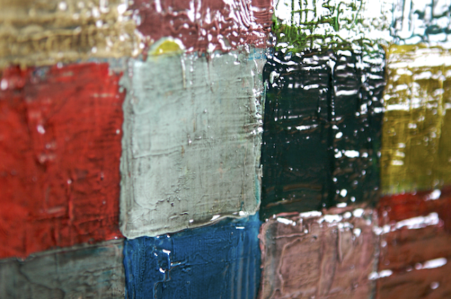
Here is a closeup of the 30 in. x 40 in. oil painting I have been working on (first mentioned in this post). In February, I decided to paint over a French landscape that I had started many years ago.  Painting over a nearly completed work (of 50+ invested hours) may seem ludicrous to some, but it was actually quite liberating.  I painted over the entire canvas in white so that I could see the textured layers of paint more clearly.  From there, I painted squares in a cornucopia of colors.  And, as you can see from the picture above, I like to apply paint very liberally.  To give the painting more dimension, I coated the entire painting with a thick glossy medium tinted with black paint. 

I really like how the black paint "dirtied" the painting, and I am pleased with the look of the high gloss.  A glossy surface helps define details in a work, which is true in photography as well.  The reflection of the light created by the gloss highlights the different ridges and layers of paint.  To create a dynamic interplay of dimensional qualities, I'm going to paint a flattened design on top of the gloss.  The line design will only be in one color and in a matte finish.  I'm excited to see how it turns out, but this is the step that I've been stuck at for the last month.  I can't seem to decide which direction to go, so I need your help!

Below are three different ideas that I sketched yesterday.  I would love to think which one you think is the winner.  Any other ideas are also welcomed!

1.  Scattered patterns.  Couldn't help but think rainbows.  I like the juxtaposition of the curved lines to the geometric pattern in the background. 


2.  Stylized landscape. (The straight lines might be tricky with the textured surface.  I might have to use tape to get clean and straight edges.  Tedious but could be a cool effect.)


3.  Allover pattern.  I also thought about doing an allover pattern in this style showing flowers.

What is your vote?

The famous through the eyes of Imogen Cunningham

Apr 14, 2010

Magnolia Blossom (1925), Two Callas (1925)

I have always been an admirer of Imogen Cunningham's botanical photography.  Yesterday I discovered some of her portraits of famous people.  I love the candid shots, like the one of photographer Ansel Adams.  And the photo of actor Cary Grant is striking don't you think? 

(A fun little fact about Imogen- she was born here in Portland!)

 Ansel Adams (1953), Cary Grant (1932)

Frida Kahlo Rivera (1931),  Alvar Aalto (1961)

Upton Sinclair (1934), Self-portrait (1932)
[image source: photoliaison.com]

How to get your art in boutiques

Apr 12, 2010

My shop [image sources from left: Lucky MagazineBoone Rodriguez, and Hadley Hutton]  

Many of you may be at a place where you are ready to showcase your work in stores other than your Etsy shop.  Although online marketplaces like Etsy are great avenues for artists to broaden their fan base, art, for the most part, sells better in physical spaces than on the internet.  I have been a retailer of art and handcrafted products myself, and I have perused thousands of submissions from artists and designers.  Only a small percentage actually piqued my interest, and here's how they did it.

1.  The fit is right.  Reach out to shops that sell similar art and products.  To know if you're a good fit, you first need to be able to define your target customer.  If your customer would (and could) buy from the majority of the product lines in the shop, then you have a good match.

2.  Beautiful photography.  It's all about first impression and in most cases you only have a few seconds if you're submitting your work to a shop owner via email.  If you're not much of a photographer, then you need to hire someone who can take high quality product shots.  And all you need for a submission letter are three or four really good photos. 

3.  Brief and concise submission letter.  Ideally, you should show your collection in person.  If this isn't possible, then email a submission letter to the shop owner.  The subject line should be a short description of your collection, such as: new bamboo jewelry collection made in Portland.  The body of the email should be no longer than six sentences, including information on artist's background and current collection.

Don't take it personally if you don't hear back from a store.  The store buyer is most likely inundated with other submissions.  Most stores also have buying seasons, so it may not be the ideal time for the shop owner to pick up a new collection.  If you don't hear back from a store buyer within two weeks, try a follow-up email. 

From your own personal experiences, I'm sure some of you can contribute to this list.  Feel free to add more advice for other artists in the comment section.

Giving new life to vintage furniture

Apr 11, 2010

Yup, I could wake up every day to dandelions dancing around my head. This Dandelion Field Bed from Chair Couture goes to show that reupholstered vintage pieces can look current and chic as well as aid the sustainable living cause.  I love the idea of pairing old with the new and creating one-of-a-kind pieces.  When we opened our shop a few years ago, we outfitted a vintage settee with a plaid pattern.  I called it a love story- Miss Victoria meets Mr. Lumberjack.

Here are a few other wonderful reupholstered finds that inspire us to think creatively when furnishing our homes. 

Recently reupholstered couch of Canadian designer Bev Hisey.

Antique Capitone French Bed

Waterloo Armchair

Creating prints of my art

Apr 9, 2010

Playing around with my new (used) printer.  I created some business cards on recycled paper.

When I first started selling my art online this past Fall, I wanted to focus on creating affordable original art.  But, lately, I have been thinking about making prints of my work. I started researching decent printers and eventually found a deal on craigslist that I couldn't pass up.  I bought an Epson 1900, which is a pigment inkjet printer.  The advantage of pigment ink is its archival quality.  Supposedly prints can last 100 - 200 years.

So, for the past week, I've had fun testing out my new toy.  For the first couple of days, I experimented printing on different inkjet papers.  I went to a local photo store and bought a couple of sample packets of Hahnemuhle and Canson fine art papers.  There were eight different sheets that I ran through the printer, all with the same image.  I was surprised to find that there really wasn't much of a difference between the different kinds of paper.  Although I really liked the weight of Hahnemuhle's Museum Etching paper, I eventually bought a packet of Hahnemuhle's Sugar Cane paper, which is made from sugar cane fibers and recycled materials.


The sugar cane paper has a textured and matte surface.  Yesterday, I decided to print a photo of the Columbia Gorge that I took just a day prior, and I loved how it turned out.  The photo looks somewhat like a painting (especially the background), which was the effect I was going for. 


Here's another photo I took on our trip to the Gorge.  The print is a little darker than the actual photograph, but I ended up liking the darker, muted colors as much as the original image.


Future printing projects I have in mind include postcards and notecards. I would also like to create a limited edition pocketbook gallery. The little books would be printed and assembled in my studio, so I'll need  to work on the logistics of all that.

Portland art shop and artists helping local schools

Apr 7, 2010


I went bridge jumping once, and all I got from it was a sore bum.  My adrenaline rush doesn't come from extreme sports, it comes from shopping for new art supplies. So you can imagine my excitement when I discovered another local art supply store called Muse Art + Design.  Located in the popular Hawthorne Street neighborhood, Muse Art + Design has an impressive concentration of professional-grade products.  The space is small, but the supplies are well-organized and easy to find. Spanning one wall are paint collections from notable companies like Gamblin, Daniel Smith, and Sennelier.  I was even pleasantly surprised to find in the store an extensive collection of Sumi-e materials. 

Yesterday I picked up a new paper pad that I had been coveting since my last visit.  It is called Canal Paper, and it is made by Saint-Armand, a small paper mill in Montreal.  Flax straw and offcuts of t-shirts and denim are used to make the paper.  The texture and color of the paper is amazing, and the oblong shape of the paper is perfect for landscape drawings.  I can't wait to test it out!

For the entire month of April, Muse Art + Design is running an event called An Artist A Day.  On each day in April, a Portland-based artist is at the shop working on an original piece of art.  The thirty pieces will then be auctioned off on Thursday, May 13th to benefit Schoolhouse Supplies, a local program that helps teachers stock their classrooms with needed classroom supplies.  For a full list of participating artists in An Artist A Day or for more details on the event, go here.  Shown above are two works just completed this week by Rachel Austin and Addie Boswell, and seen below is artist Jason Kappus working on his original piece yesterday.  Each art work will start at a minimum bid of $75, which is a steal considering the finished works are 16" x 20".  What a great way to add to your art collection and help the local school district! 

The enchanted world of artist Ann Wood

Apr 5, 2010


Brooklyn artist Ann Wood has an amazing gift of turning scraps of fabric, paper, and wire into endearing and timeless works of art.  Her blog is one of my favorites as I feel like I'm in a fairy tale.   Handmade castles, ships with sails, and winsome creatures- what more could a romantic girl ask for?  (A knight in shining armor, I suppose, but a guy who washes the dishes will do.)

The pictures on Ann's blog are so beautiful, too.  I love these two snapshots of her place.


As an artist, I appreciate seeing Ann's works in progress.  Here are a couple of photos showing a blue bird in the making and some salvaged paper that is being used in a paper mache project. 


And Ann is generous in sharing her creative ideas with others.  This is a lovely pattern of a cardboard horse that she designed.  I absolutely love the look of the stampede!


Ann's speciality are little charming birds made from vintage fabrics.  The bride and groom are adorable, but the striped pirate bird is hard to resist!  See more of her handmade bird collection in her shop.

Related Posts Plugin for WordPress, Blogger...